Websites
What every local service website needs above the fold
Visitors decide in seconds whether to call you or hit back. Here’s exactly what needs to be on the first screen, on a phone, before anyone scrolls.
 LeadsGeeks Team3 min read
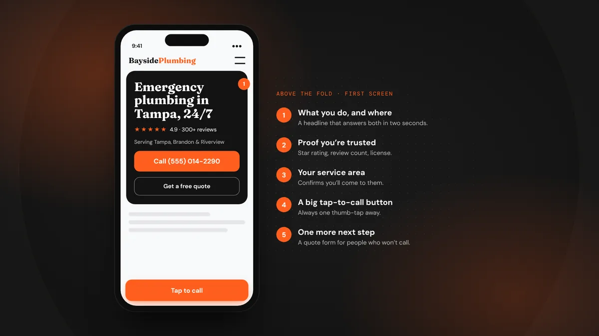
“Above the fold” is the part of your website people see before they scroll. For a local service business, most visitors arrive on a phone, often in a hurry. If that first screen doesn’t tell them what you do, where you do it and how to reach you, they go back to Google and call the next company.
- Design for a phone first. That’s where most of your visitors are.
- The first screen needs five things: what you do, where, proof, a call button and a clear next step.
- Cut sliders, autoplay video and vague slogans. They slow the page and say nothing.
The five things on the first screen
- A headline that says what you do and where.“Emergency plumbing in Tampa, 24/7” beats “Quality you can trust.” Visitors should know in two seconds they’re in the right place.
- A tap-to-call button.Big, high-contrast and visible without scrolling. On mobile, keep it fixed to the bottom of the screen so it’s always one tap away.
- Proof you’re trusted.Your star rating and review count, years in business, license or certification badges. Real numbers, not “5-star service!”
- Your service area.A short line like “Serving Tampa, Brandon, Riverview and Wesley Chapel.” It confirms you’ll come to them.
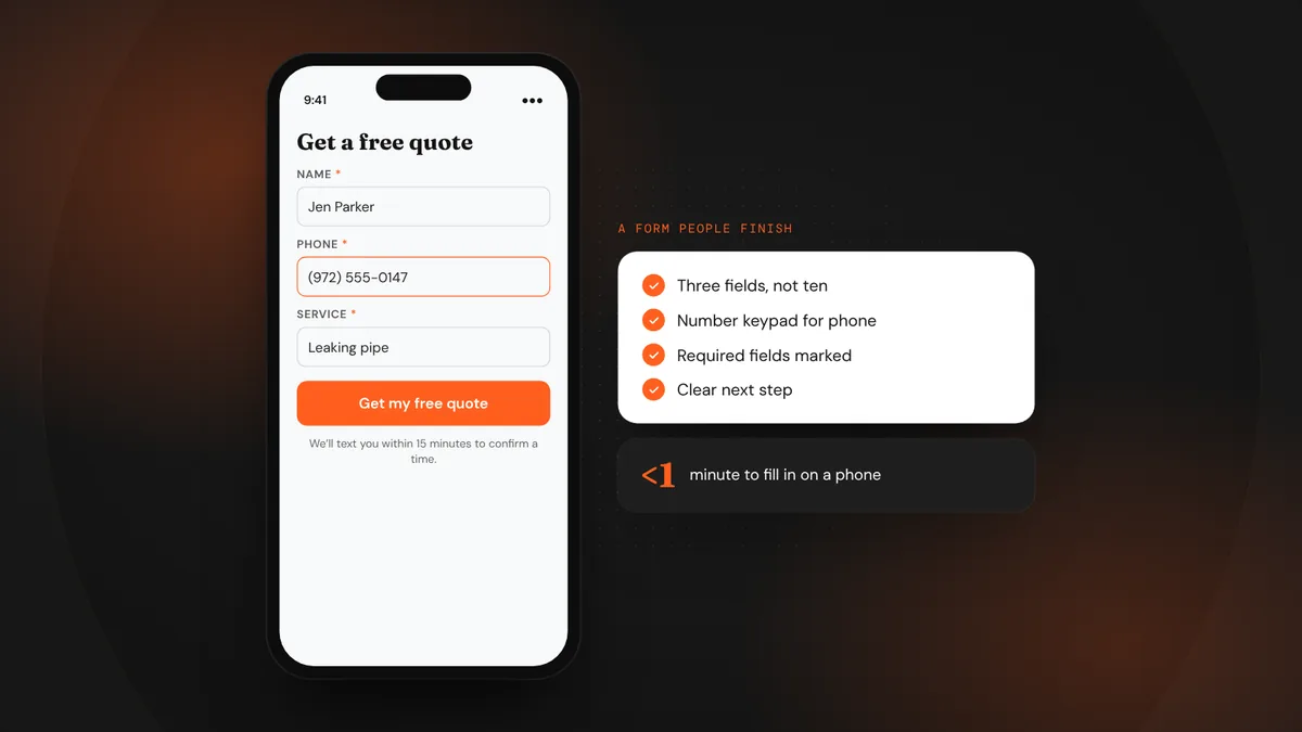
- One clear next step besides calling.A short quote form or a “Book online” button. Some people won’t call, especially after hours.
Design for the phone in their hand
Look at your site on your own phone, outdoors, with one hand. Can you read the headline without zooming? Can you hit the call button with your thumb? Does the page load before you lose patience? If the answer to any of these is no, fix that before anything else.
- Headline at least 28px on mobile, with short lines.
- Call button at least 48px tall, in your strongest brand color.
- Hero image compressed and sized for mobile. Large images are the most common cause of slow pages.
- No pop-ups covering the first screen.
What to cut
Many local sites bury the important things under decoration. Remove or move down:
- Image sliders. Most people never see slide two, and they slow the page.
- Autoplay background video. It looks nice on a desktop and drains phones.
- Vague slogans. “Excellence in every job” could be any company in any trade.
- Long welcome paragraphs. Nobody reads “Welcome to our website” on a phone.
What goes right below
Once the first screen earns the scroll, the next sections should answer the questions people ask before calling: what services you offer (each linking to its own page), recent reviews, photos of real jobs, how pricing or estimates work, and your guarantee. End every section with another chance to call or book.
Test it in 10 seconds
Then check speed with Google’s free PageSpeed Insights. Focus on the mobile score and on “Largest Contentful Paint,” which is usually your hero image. A fast, clear first screen is one of the cheapest ways to get more calls from the traffic you already have.
Frequently asked questions
Should my phone number be in the header?
Yes. On mobile, a tap-to-call button in the header or fixed at the bottom of the screen is the single most important element on the page.
Do I need a video on my homepage?
Not above the fold. A short video further down the page, like a quick intro from the owner, can build trust, but it shouldn’t slow down the first screen.
How fast should my site load?
Aim for the main content to appear within about two and a half seconds on a phone. Google’s PageSpeed Insights shows this as Largest Contentful Paint.
LeadsGeeks TeamWe build search, review and follow-up systems for local service businesses: the pages, profiles and automations that turn searches into booked jobs.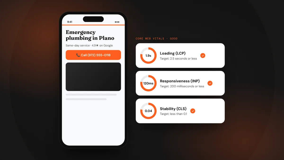 WebsitesIs your website fast enough? Speed and mobile basics
 WebsitesQuote request forms that people actually finish
 AI searchWhat AI search readiness means for a local service business