Websites
Quote request forms that people actually finish
A quote form is the moment a visitor becomes a lead. Here’s how to design one that’s quick on a phone, asks only what you need and tells people what happens next.
 LeadsGeeks Team3 min read
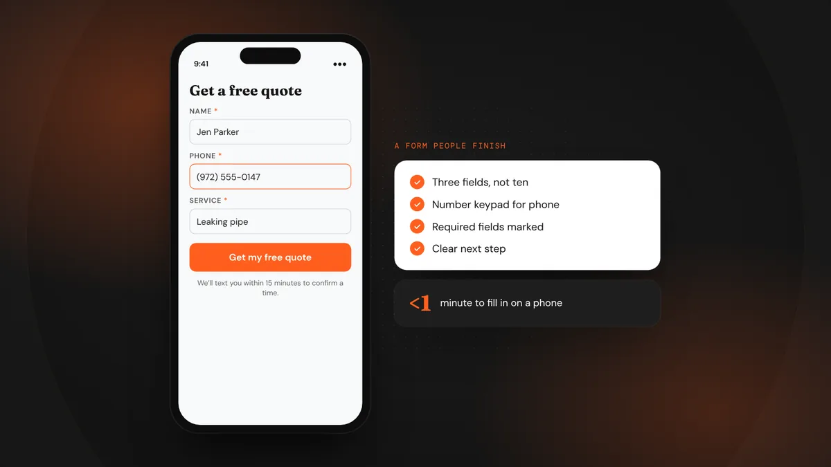
Every field on a form is a small question: “Is this worth it?” Ask too many and people quit halfway through, usually on a phone, often without you ever knowing they tried. A good quote form feels like the start of a conversation, not a questionnaire.
- Ask only what you need to call them back and start the quote.
- Make it easy on a phone: big fields, the right keyboards, no tiny dropdowns.
- Tell people exactly what happens after they press send.
Ask for less
Start with the minimum: name, phone, email and what they need. Everything else (address details, photos, budget, timing) can come in the follow-up conversation, or as optional fields further down.
Make it easy on a phone
- Use the right field types.Phone fields that open the number keypad and email fields with the @ key save customers time.
- Make tap targets big.Fields and buttons should be easy to hit with a thumb.
- Show errors clearly.If something’s wrong, say what and where, next to the field, without clearing what they typed.
- Mark what’s required.People shouldn’t find out after pressing send.
- Let browsers autofill.Standard field names let phones fill in name, email and phone with one tap.
Say what happens next
Uncertainty stops people. A line under the button, and a clear thank-you page, remove it.
We’ll text you within 15 minutes during business hours to confirm a time. No obligation, and we never share your details.
- Use a button label that describes the result: “Get my free quote,” not “Submit.”
- Send an instant text or email confirming the request was received.
- Only promise a response time you can keep.
Frequently asked questions
Should I ask for a budget on the form?
Usually not as a required field. Many customers don’t know yet, and it can feel like a test. Ask in the follow-up conversation instead.
Is a multi-step form better than one page?
It can be, for longer forms. Starting with easy questions (service, ZIP) and asking for contact details last often feels lighter. Test what works for your customers.
Where should the form go on the page?
Near the top on desktop, and reachable with one tap on mobile, plus a click-to-call button for people who would rather talk.
LeadsGeeks TeamWe build search, review and follow-up systems for local service businesses: the pages, profiles and automations that turn searches into booked jobs. WebsitesWhat every local service website needs above the fold
 WebsitesIs your website fast enough? Speed and mobile basics
 AI searchWhat AI search readiness means for a local service business